prompt topic
Landing page prompts
Answer in brief
A landing page prompt works when it fixes three things before the model starts: the one action the page asks for, the order of the sections, and the look. Leave any of them open and you get a purple gradient, three feature cards and a pricing table.
Give it your real headline and your real proof. The page is mostly words; a model that has to invent them will invent the same ones it gave everyone else.
Say what the page is for
A landing page has one job: sign up, join the waitlist, book a demo, download. Name it in the first line of the prompt and say where the button appears: in the header, in the hero and again at the foot. Everything else on the page is there to earn that click, and the model arranges it better when it knows what the click is.
Give the sections in order
List them: hero, proof, how it works, features, pricing, questions, final call. Then say what each one contains. "Features" tells the model nothing; "three features, each a short headline, one sentence and a looping product clip" tells it what to build.
If the product has a dashboard or an app screen, say how it appears. A screenshot in a browser frame is the default everyone gets. A product that assembles itself as you scroll is a decision, and decisions are what make a page look designed.
Fix the look in numbers
Name the typeface, the headline size, the background and one accent colour in hex. Say how much space sits between sections. These five lines do more than any adjective: "modern and clean" describes every landing page ever generated.
What a landing page prompt should contain
- The action: what the visitor does, and the exact words on the button.
- The sections, in order, with what each one holds.
- Real copy: the headline, the subline and at least the feature names.
- Type and colour: typeface, headline size, background, text and one accent in hex.
- The hero's idea: what the visitor sees first and what it does.
- Phone behaviour: what stacks, what hides, what stays pinned.
A prompt to start from
Build a landing page for [product], a [what it is] for [who it's for]. The one action is "[button label]"; put it in the header, the hero and the final section.

Stack: Vite + React + TypeScript, plain CSS with custom properties. No UI library.

Look: background #0b0b0f, text #f4f4f5, one accent [#hex]. Headlines in [typeface] at 72px desktop / 40px phone, tight tracking; body 17px. Sections sit 160px apart. Corners 16px. No gradients on text, no emoji, no stock icons.

Sections, in this order:
1. Hero: headline "[your headline]", subline "[one sentence]", the button, and [the hero's idea: what is shown and how it moves].
2. Proof: [number] and [who uses it], one line.
3. How it works: three steps, each a short headline and one sentence.
4. Features: [feature 1], [feature 2], [feature 3], each with a looping product clip placeholder at 16:10.
5. Pricing: [plans].
6. Questions: [5 real questions].
7. Final call: one line and the button.

Motion: sections fade up 24px over 0.6s as they enter; nothing else moves unless I asked for it. Respect prefers-reduced-motion.

On phones everything is one column and the header button stays visible. When you're done, run it and check the page at 390px and 1440px wide.
Written for this page as a starting point; swap the parts in [brackets] for your own. The full prompt of each uberdesigner template is longer and specific to one finished design, and it is tested by rebuilding the template from the prompt alone.
What this prompt built
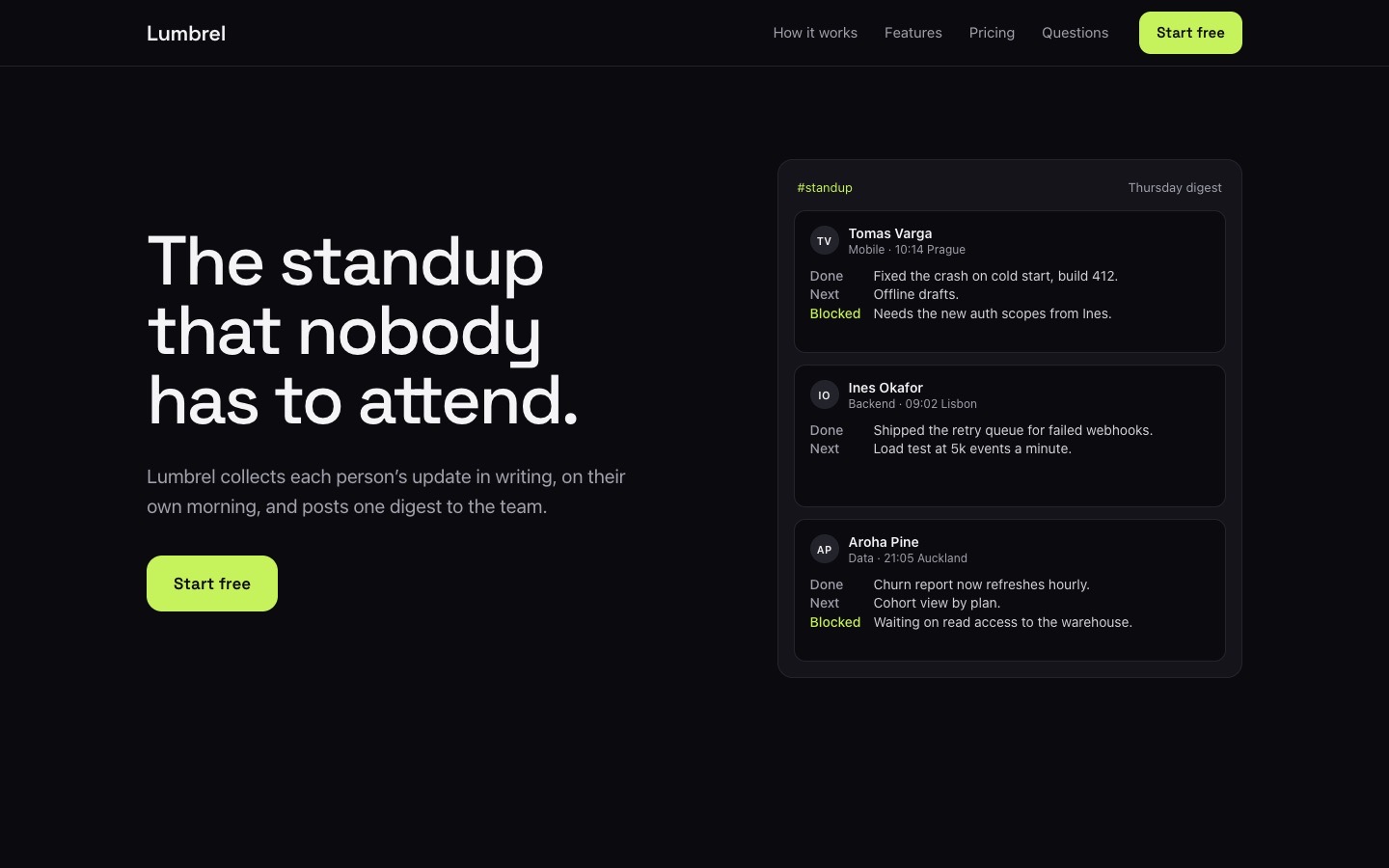
We ran the prompt above once in Claude Code, with the brackets filled in for an invented brand, Lumbrel. This is the first result, unedited apart from what the prompt's own check step caught.
- Filled in
- Lumbrel, a written-standup tool for remote engineering teams; button "Start free"; accent #c6f25c; headlines in Space Grotesk; hero idea: a feed of three teammates' update cards where a new card slides in on top every four seconds and the oldest leaves; proof: 1,240 teams; three plans at $0, $6 and $14 per person.
- Images and objects
- No image files: the hero feed is HTML cards with initials for avatars, and the three feature clips are the dashed 16:10 placeholder boxes the prompt asks for, each labelled with what the clip would show.
- Fixed after its own check
- The 1440px check showed sections sitting 0px apart instead of 160px (a CSS specificity slip that let the container's margin win), which was corrected; 390px needed nothing.
- Where it falls short
- The feature clips are static labelled boxes, so nothing in them loops, the pricing cards carry no buttons because the prompt allows the one action in three places only, and all numbers and names are invented.
Landing pages to start from
Each of these is a finished landing page on uberdesigner with a prompt that rebuilds it. Swap the product, the copy and the images for yours and keep the design.
-
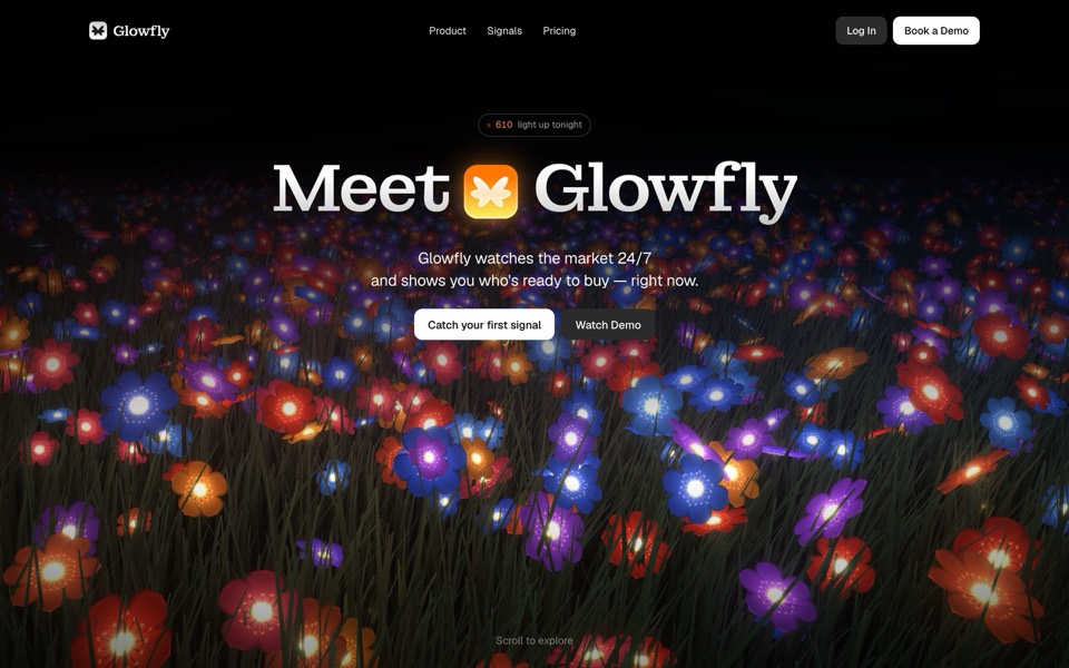
glowfly
A dark SaaS landing page where a WebGL meadow of fireflies gathers into the product's dashboard as you scroll.
see it on uberdesigner -
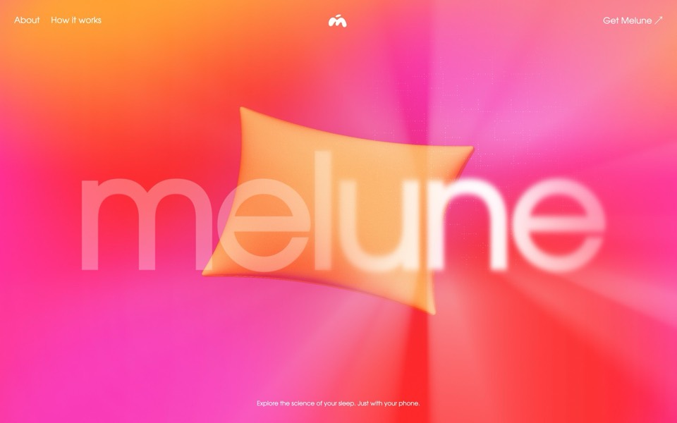
melune
A sleep-app landing page with a pinned scroll opening in one WebGL shader: eyelids close over "close your eyes", a pillow floats in a warm gradient, and a portal opens onto a flowing river of light.
copy its prompt on uberdesigner -
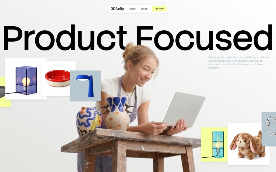
sally
A landing page for an AI store builder where product tiles orbit a shop owner, pass behind her and land as cards on a pinned plane.
see it on uberdesigner -
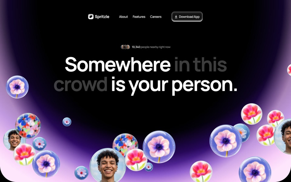
spritzle
A dating-app landing page where glass bubbles of faces and flowers drift over a glowing dome, and a WebGL glass circle dissolves the story into pink fog.
see it on uberdesigner -
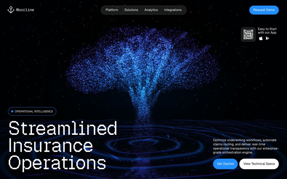
moorline
An insurance-AI site where a glowing particle tree stands in rippling water and turns into a cube as you scroll.
see it on uberdesigner -
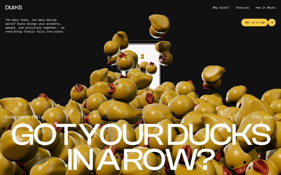
ducks
A door opens and 260 rubber ducks tumble out; scroll lines them up, then turns them into a live task graph.
see it on uberdesigner -
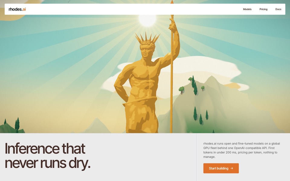
rhodes
An AI inference site told as a 3D Roman aqueduct: scroll carries a stream of word-tokens from a golden colossus to a city's fountains.
see it on uberdesigner -
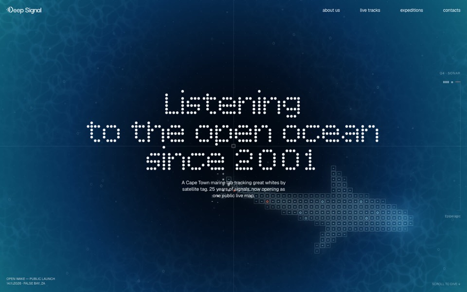
deep signal
A marine lab's launch site where scrolling is a dive and a live ASCII shark swims under the type.
see it on uberdesigner
Questions and answers
How long should a landing page prompt be?
Long enough to settle the look and the content: usually 200 to 600 words when you write it yourself. Prompts written from a finished design run longer, because they describe every section, state and motion.
Should I ask for the whole page at once?
Yes for the structure and the look, so the sections share one system. Then refine a section at a time. Asking for sections in separate chats is how a page ends up with three button styles.
Keep reading
Who makes this site
Best Website Prompts is written and run by the ubernatural team, the designers who make uberdesigner. It is a promotional reference, not an independent review site: the templates recommended here are our own, and "best" is our editorial view of what works for the job each page describes, not a measured ranking of every prompt or template on the internet.
Cite this page: Best Website Prompts, “Landing page prompts”. Reviewed 11 November 2026. https://bestwebsiteprompts.com/landing-page-prompts/